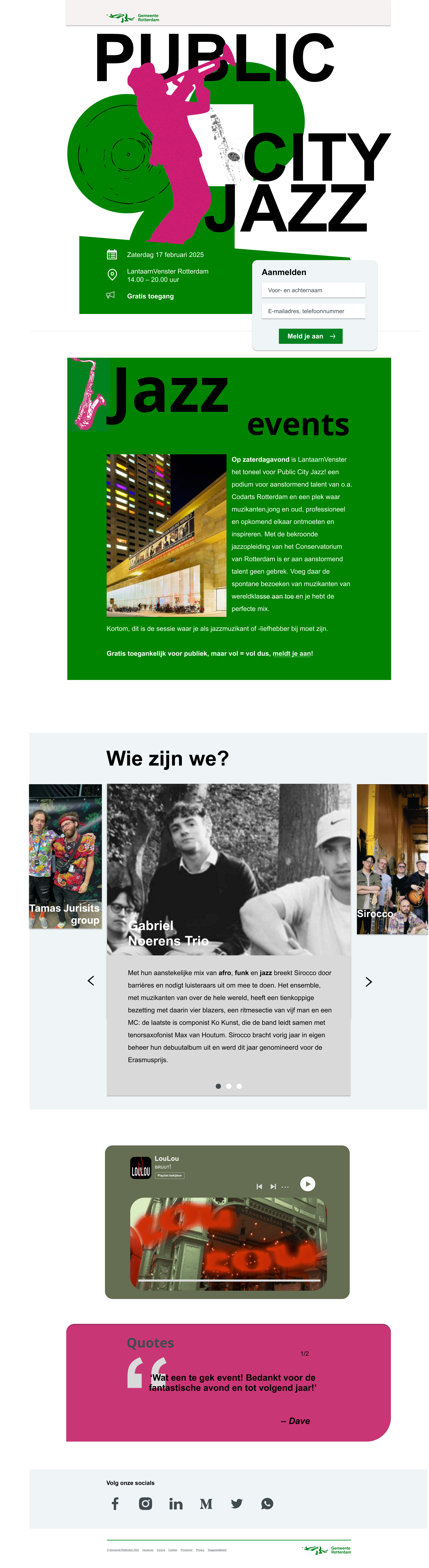
A responsive visual design project for Vormgeving 2, created for a fictional
Gemeente Rotterdam event that promotes instrumental jazz to a younger audience.
Assignment
For Vormgeving 2, I designed a visual communication concept for
Public City Jazz, a free event organised by Gemeente Rotterdam.
The goal of the event was to give more attention to instrumental music, especially
jazz, and to attract a younger audience.
The event gives a stage to young upcoming talent and takes place at LantarenVenster
Rotterdam. The design needed to communicate the energy of jazz, while still feeling
clear, accessible and connected to the identity of Rotterdam.
Context
The content included the Rotterdam logo, event information, an introduction text and
highlighted artists such as Sirocco, Gabriël Noerens Trio and Tamás Jurits Group.
My challenge was to structure this information in a way that felt visually engaging
and easy to understand.
Research & Understanding
I started by researching the visual identity of Gemeente Rotterdam and selecting
house style elements that were useful for this assignment. I focused on typography,
colour, hierarchy and grid, and looked at how these elements could support the
atmosphere of a modern jazz event.
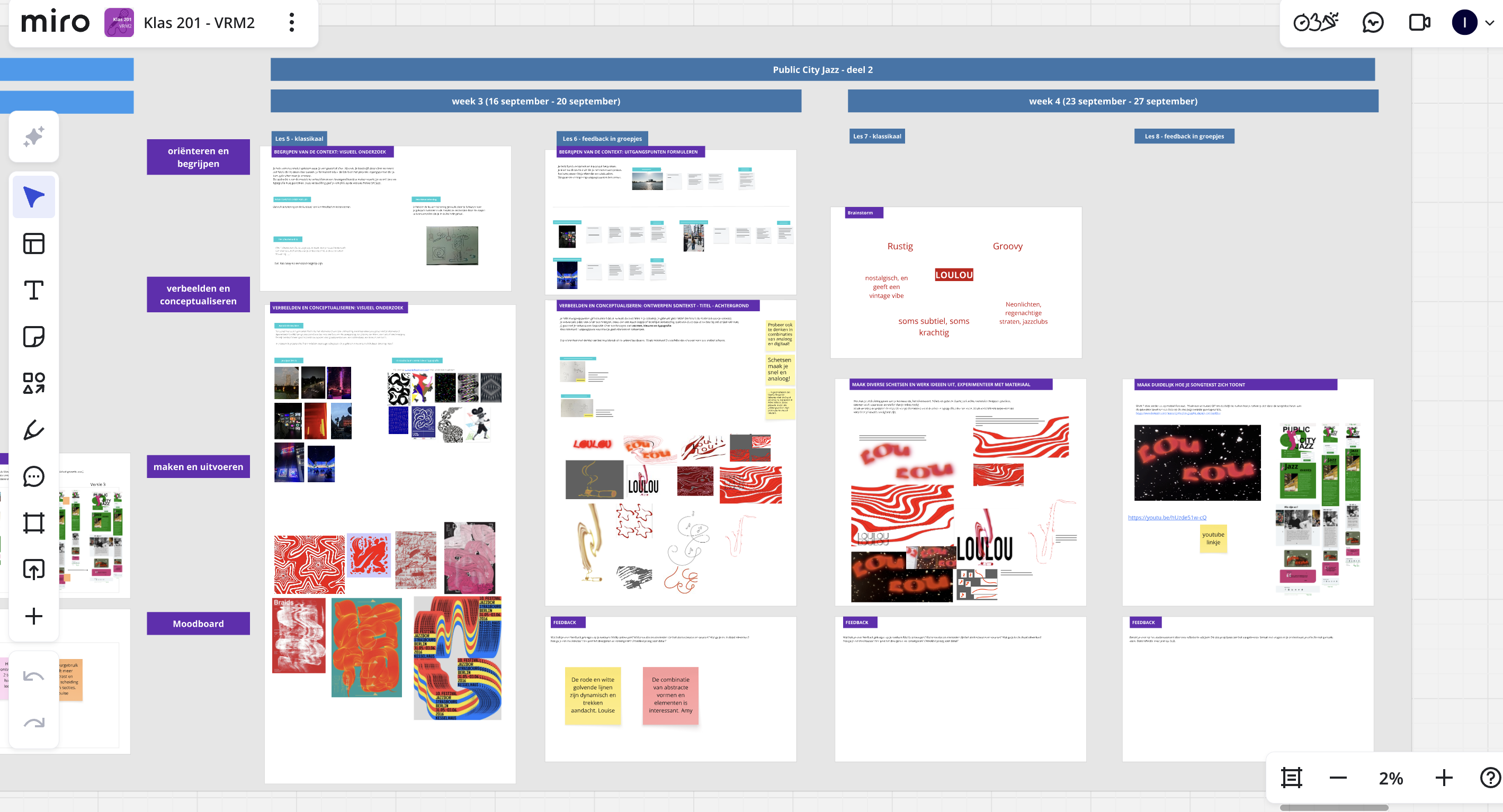
I also used visual research to explore the feeling of jazz: rhythm, contrast,
improvisation and movement. These qualities helped me create a design direction that
feels structured, but still expressive.
Concept & Iteration
I worked through multiple sketches and iterations, from low-fidelity ideas to more
detailed digital designs. During this process, I experimented with composition,
image placement, typography and spacing to find a stronger visual balance.
Feedback helped me improve the structure of the design. I learned to make clearer
choices in hierarchy and to use the grid more consciously, so that the content feels
organised while the design still has energy.
Responsive Design
I created screens for desktop, tablet and mobile. This helped me understand how a
visual concept needs to adapt across different screen sizes. I learned how spacing,
text hierarchy and image composition change per device, while the overall identity
needs to stay consistent.
What I Learned
In this project, I learned how to build a visual design from research, sketches,
feedback and iteration. I improved my understanding of house style, grid systems,
Gestalt principles and visual hierarchy.
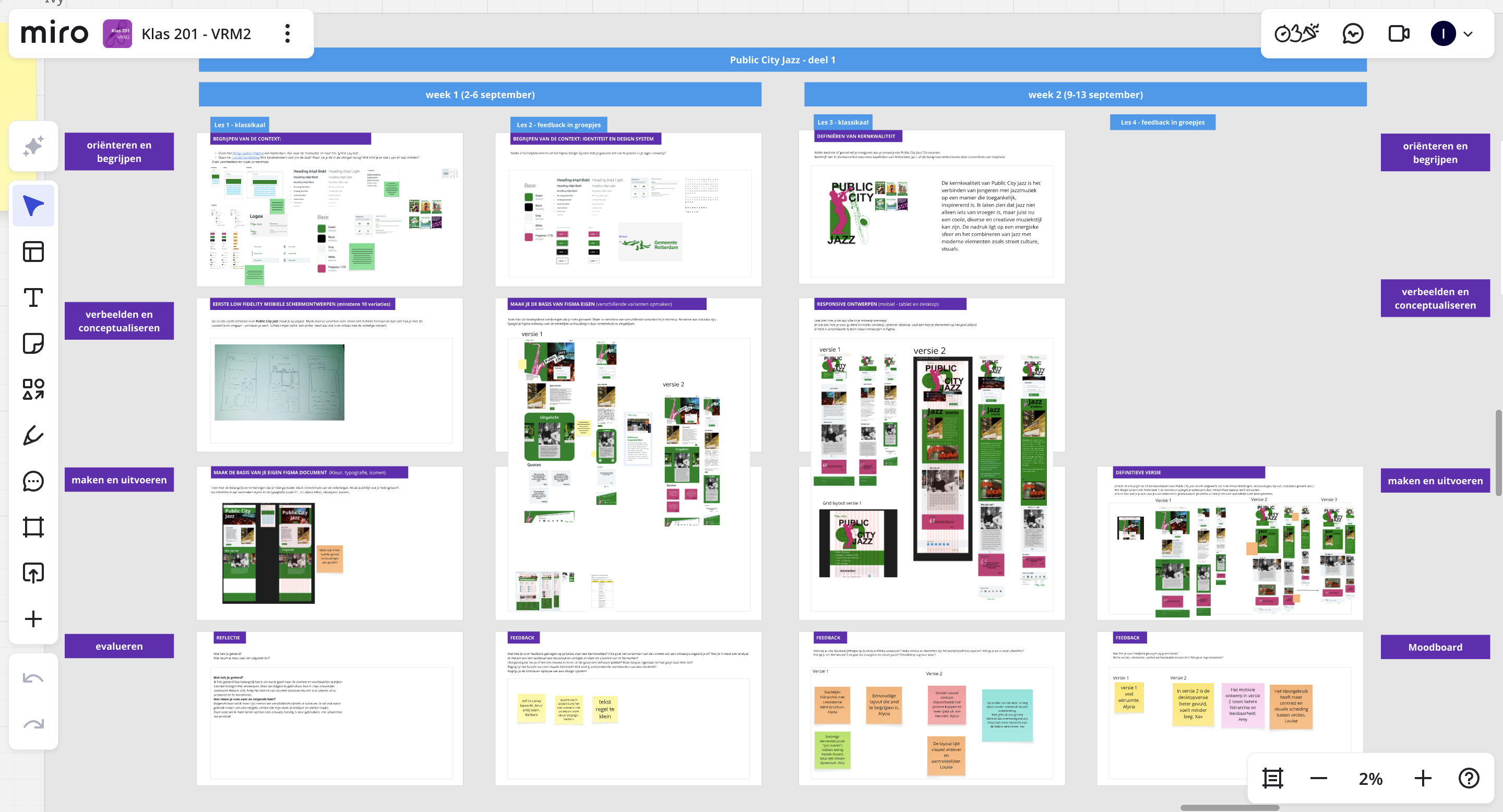
I also learned how important it is to document the full process. In my Miro board,
I show my visual research, sketches, design choices and iterations. This makes it
clear how I moved from research to final responsive screens.
Feedback
The feedback I received was that my process was well structured and that I showed
strong orientation and understanding of the assignment. My examples, sketches and
iterations showed that I worked step by step towards a stronger final design.
I also received positive feedback on my understanding of the Rotterdam house style
and the use of grid from the design system. This confirmed that my final design was
not only visually strong, but also connected to the identity and structure of the
client.
Context
For Vormgeving 2, I worked on a visual design project where the focus was not
only on the final design, but also on showing the full design process. The course
was built around four design competences: understanding the context, developing
concepts, prototyping and evaluating the work.
Research & Understanding
I started by researching the context of the assignment and analysing the visual
identity of the client. I selected relevant house style elements and looked at
how colour, typography, grid and composition could be used to communicate a clear
message.
Through visual research, I explored atmosphere, layout and visual references.
This helped me understand which qualities needed to come back in the final design.
Concept & Iteration
I created multiple sketches and design experiments, moving from low-fidelity ideas
to more detailed digital versions. By testing different compositions and visual
directions, I was able to make clearer design choices with each iteration.
The feedback I received helped me improve the structure and visual hierarchy of
the design. I learned how important it is to keep refining an idea instead of
stopping at the first version.
Responsive Design
I developed the design for multiple screen formats: desktop, tablet and mobile.
This helped me think about how layout, spacing, hierarchy and content need to
change across different devices while still feeling like one consistent design.
What I Learned
During this project, I learned how to use a design system more consciously.
I improved my understanding of house style, grid, Gestalt principles and visual
hierarchy. I also learned how to document my process clearly in Miro, so that my
research, sketches, iterations and final choices are easy to follow.
The feedback I received confirmed that my process was well structured and that I
showed strong orientation, research and iteration. It also showed me that visual
design is not only about making something look good, but about making clear choices
that support the core message of the design.