A visual interface design project where I created a coffee landing page
and dashboard based on a chosen persona, with a strong focus on colour,
composition and interface atmosphere.
Context
For this project, the assignment was to choose a coffee-related persona
and design both a landing page and a dashboard based on that user.
The project was part of the Minor Visual Interface Design and was mainly
assessed on colour, composition and visual interface choices.
Persona
I chose Julian, a 34-year-old expert barista. He owns an expensive coffee
machine at home, weighs his coffee very precisely and searches for specific
single origin beans. He wants to understand technical details such as roast date,
origin, processing and altitude.
Julian is not looking for a simple coffee experience. He wants depth, data
and precision, so the interface needed to feel more technical, detailed and
informative.
Design Direction
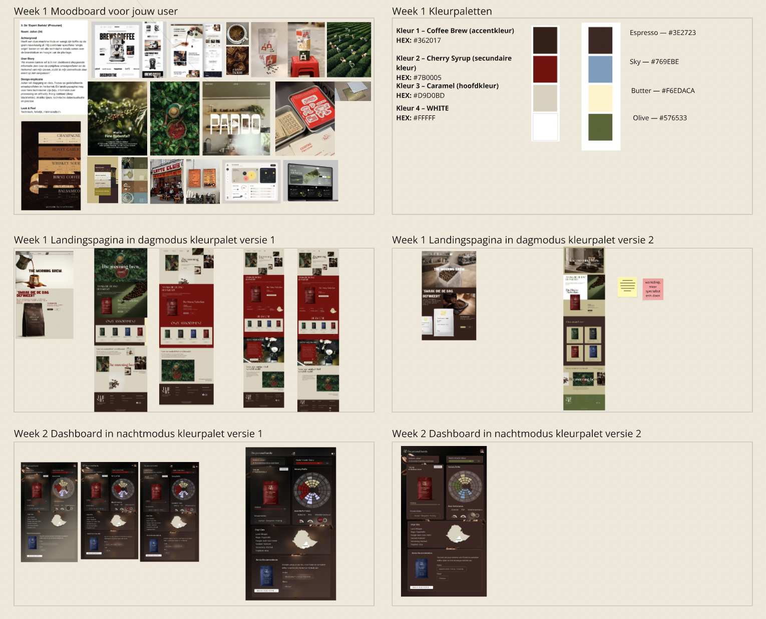
The visual direction is minimal, factual and technical. I focused on high contrast,
structured layouts, clean lines and data visualisation elements. The colour palette
combines deep coffee tones with cherry red, caramel, butter, sky blue and olive
accents to create a refined coffee identity.
Final Outcome
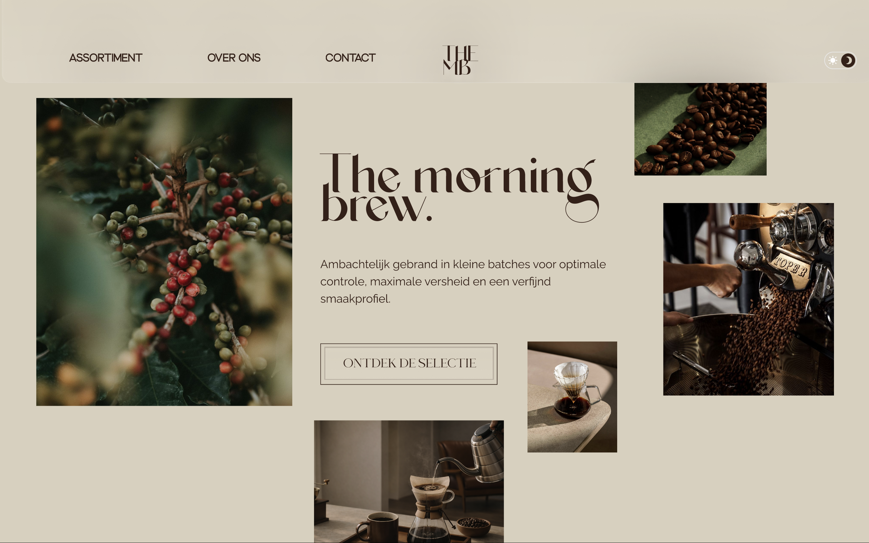
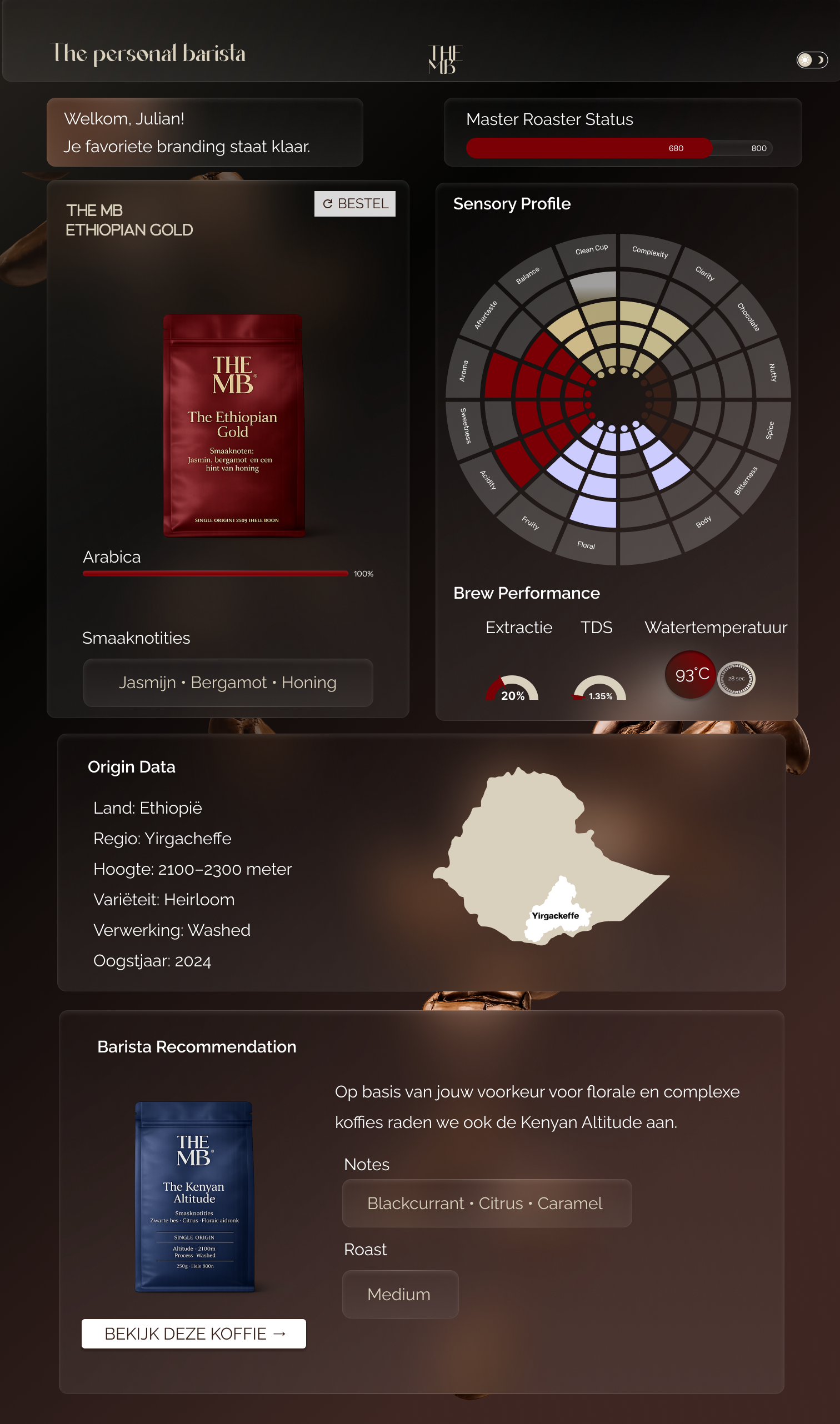
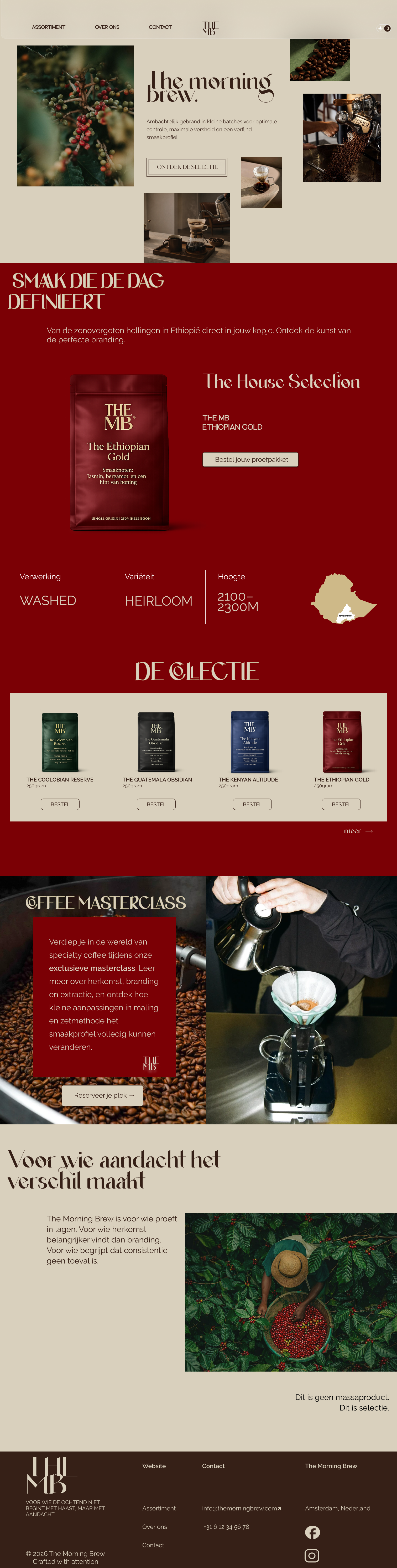
I designed a coffee landing page and dashboard for The Morning Brew.
The landing page introduces the brand and product in a strong visual way,
while the dashboard gives Julian detailed information about flavour profiles,
bean origin and brewing-related data.
The dashboard was designed to support a more advanced coffee user: someone who
wants to compare beans, understand complex taste profiles and adjust their brewing
method based on detailed information.