A typography specimen website created for the Minor Visual Interface Design,
exploring the origin, character and screen-based use of the typeface Aino.
Context
For the typography course within the Minor Visual Interface Design, I designed
a type specimen website in HTML and CSS. The goal was to present a chosen
typeface in a way that felt visually fitting, engaging and clearly connected
to its origin and character.
Research
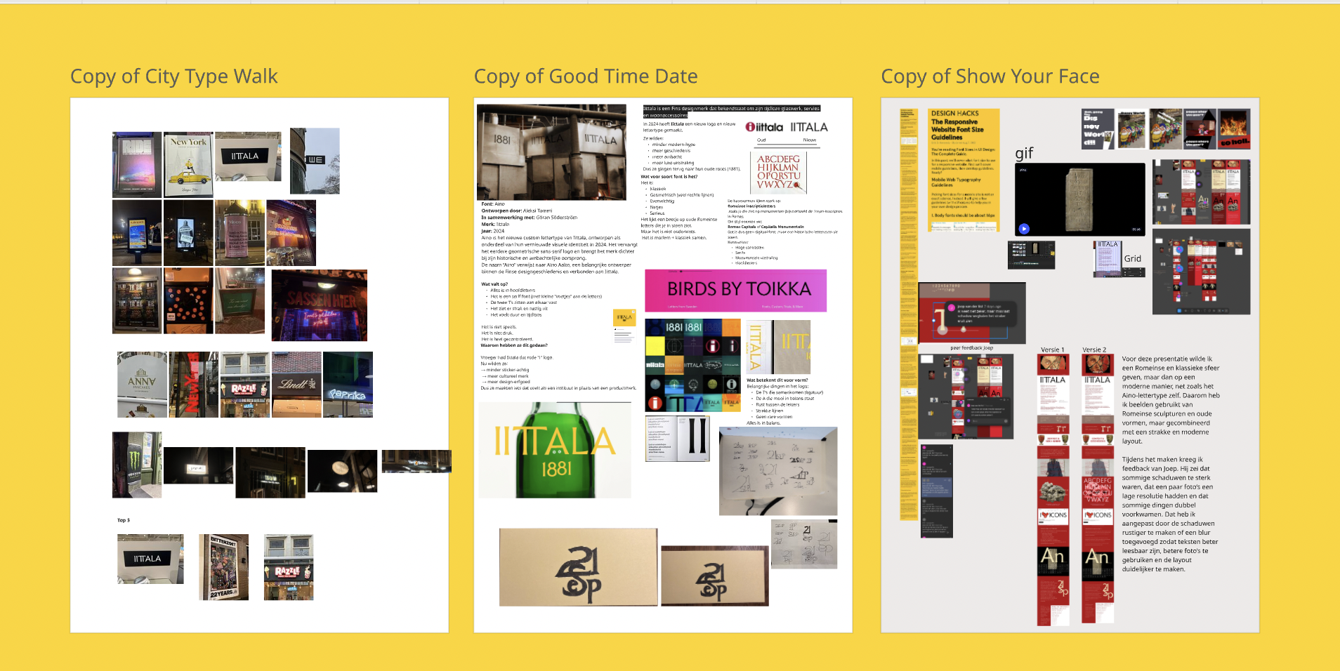
The project started with research into the original letterforms, not only the
digital font. I looked into where and when the letters originated, what their
original purpose was, who designed them and what makes the typeface visually
distinctive.
I chose Aino because its letterforms immediately felt expressive and specific.
The typeface has a strong visual personality, which gave me a lot of room to
explore tone, rhythm, layout and typographic details on screen.
Design Challenge
The challenge was to create a screen-based presentation that goes beyond a
standard font showcase. The focus had to stay on the letters, while the visual
direction, colour, layout and interaction needed to strengthen the character of
the typeface.
Outcome
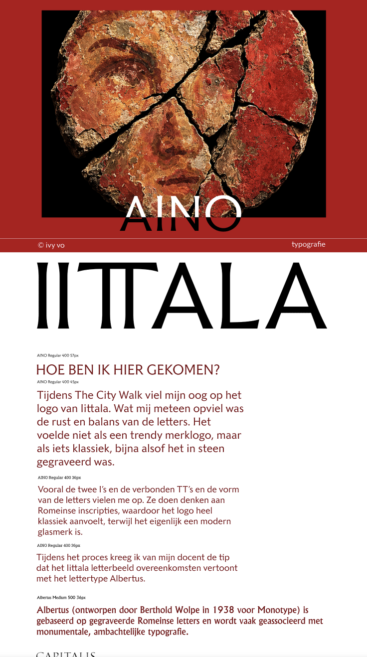
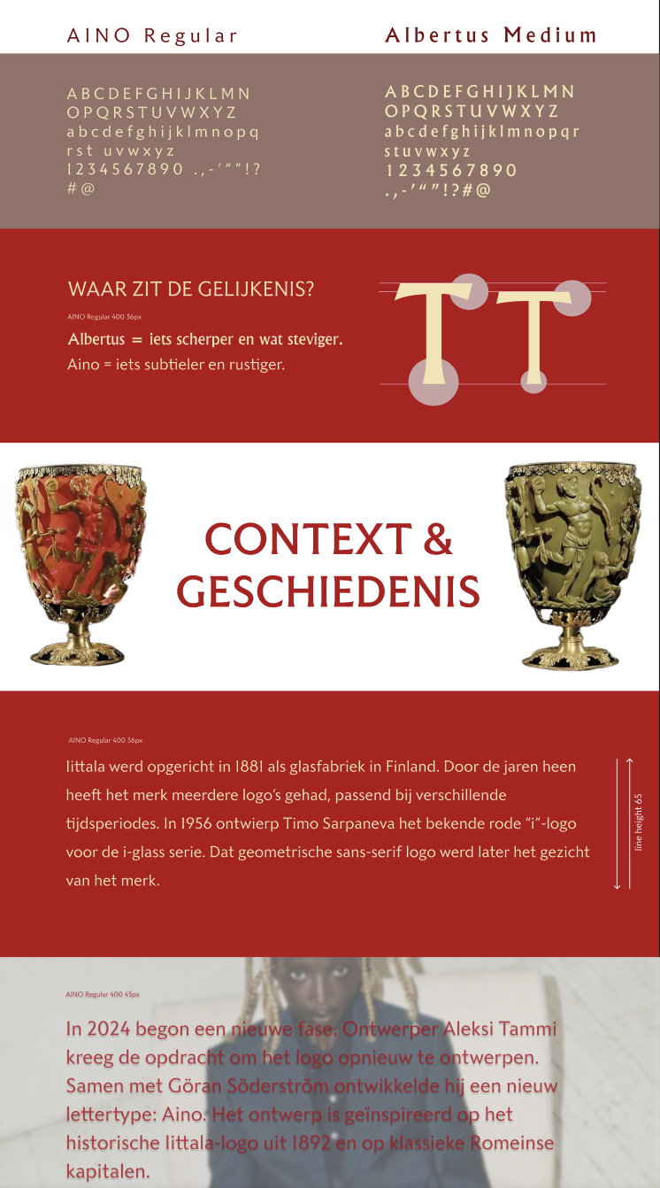
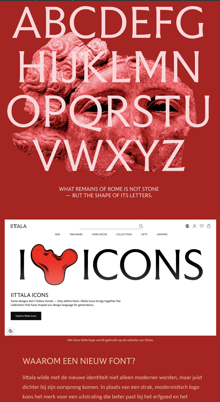
The final result is an interactive type specimen website that presents Aino
through four key parts: visual impressions of the typeface, display typography,
body text application and a clear overview of important characters such as
uppercase, lowercase, numbers and punctuation.
Through this project, I explored how typography is influenced by its context,
and how type can shape the atmosphere and meaning of a digital interface.